FEM Women's Health
Categories
Branding, Web Design
Client
FEM Women's Health
Project
FEM Women's Health
Services
Graphics design Web design & Development
Year
2026
Live Project
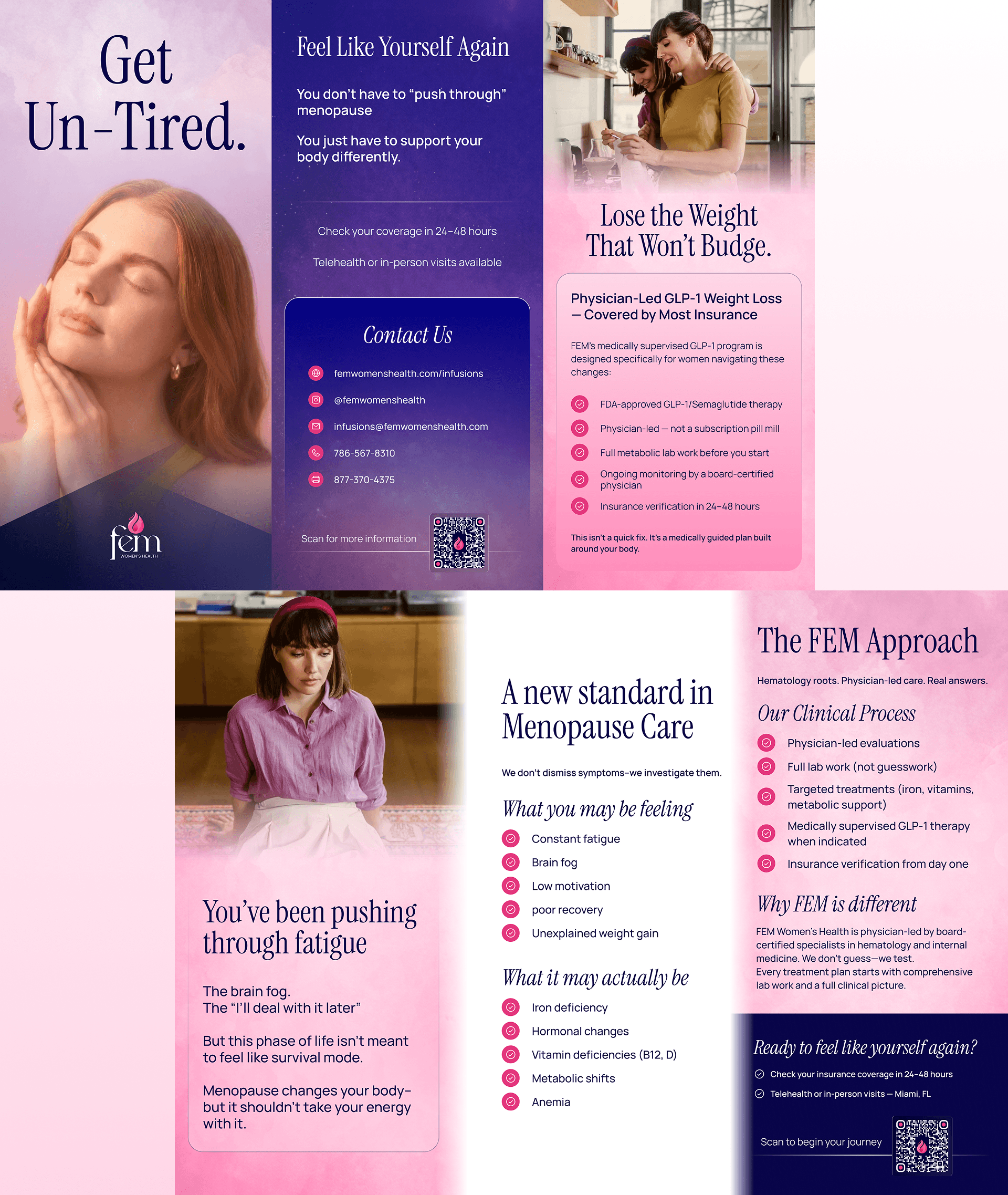
FEM Women's Health offers hematology, infusion services, and doctor-led weight loss — a mix that's hard to explain in a sentence. Most of their patients are women who show up worried, often undiagnosed, and tired of being treated like a number. The site had to feel medically serious but also warm enough that booking a first appointment didn't feel like a big deal.
FEM Women's Health offers hematology, infusion services, and doctor-led weight loss — a mix that's hard to explain in a sentence. Most of their patients are women who show up worried, often undiagnosed, and tired of being treated like a number. The site had to feel medically serious but also warm enough that booking a first appointment didn't feel like a big deal.


I built the whole thing around one line: "Healthcare is Personal, Not a Transaction." This one was designed and built entirely in Figma Sites, so there was no separate handoff step — the design and the live site are the same thing, which got it launched faster.
The three services are shown as one connected approach instead of a menu, so it's clear what they do by the time you've scrolled once. I turned their process into a simple three-step path — consult, treatment, outcome — so a nervous first-time patient can picture how it actually goes. Insurance gets its own section instead of being buried, since that's usually the first real question. Soft colours, real photography, and plain language throughout.
I built the whole thing around one line: "Healthcare is Personal, Not a Transaction." This one was designed and built entirely in Figma Sites, so there was no separate handoff step — the design and the live site are the same thing, which got it launched faster.
The three services are shown as one connected approach instead of a menu, so it's clear what they do by the time you've scrolled once. I turned their process into a simple three-step path — consult, treatment, outcome — so a nervous first-time patient can picture how it actually goes. Insurance gets its own section instead of being buried, since that's usually the first real question. Soft colours, real photography, and plain language throughout.

It feels like a real clinic, not a cold hospital portal. The three-step path takes the mystery out of the process, insurance is answered before anyone has to ask, and "Become a Patient" stays as the one clear action from top to bottom. Building in Figma Sites also meant it went live quicker than a typical design-then-build project.
It feels like a real clinic, not a cold hospital portal. The three-step path takes the mystery out of the process, insurance is answered before anyone has to ask, and "Become a Patient" stays as the one clear action from top to bottom. Building in Figma Sites also meant it went live quicker than a typical design-then-build project.